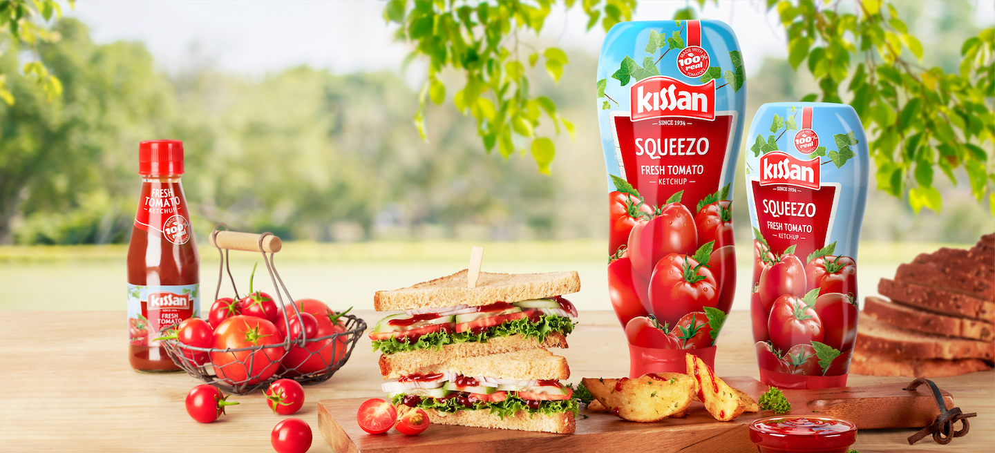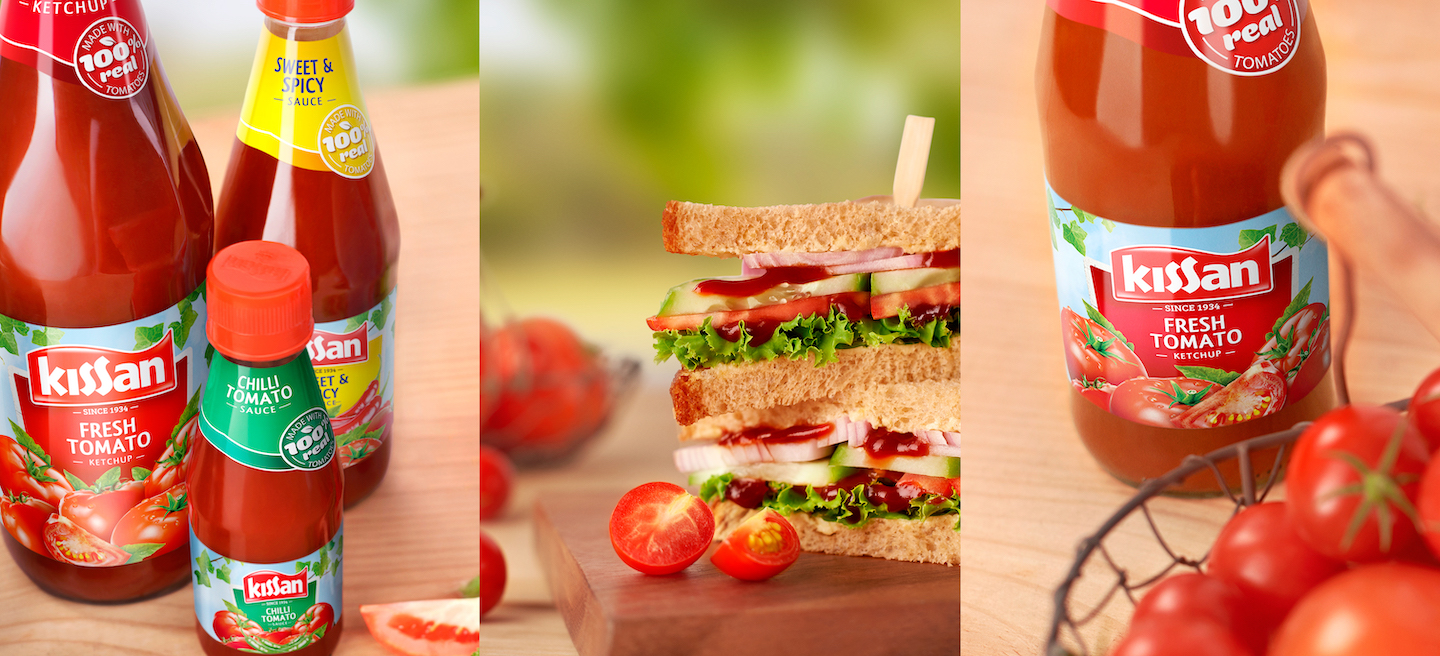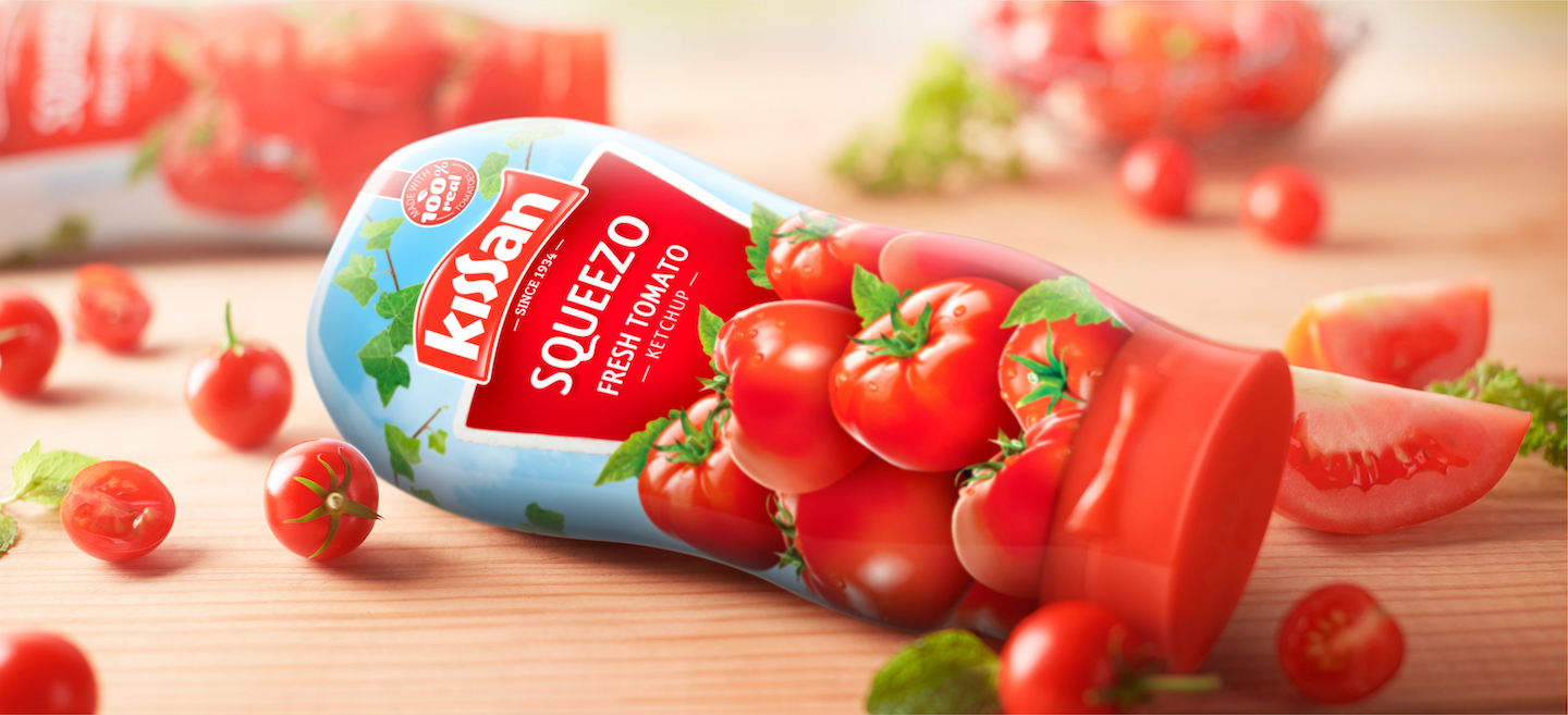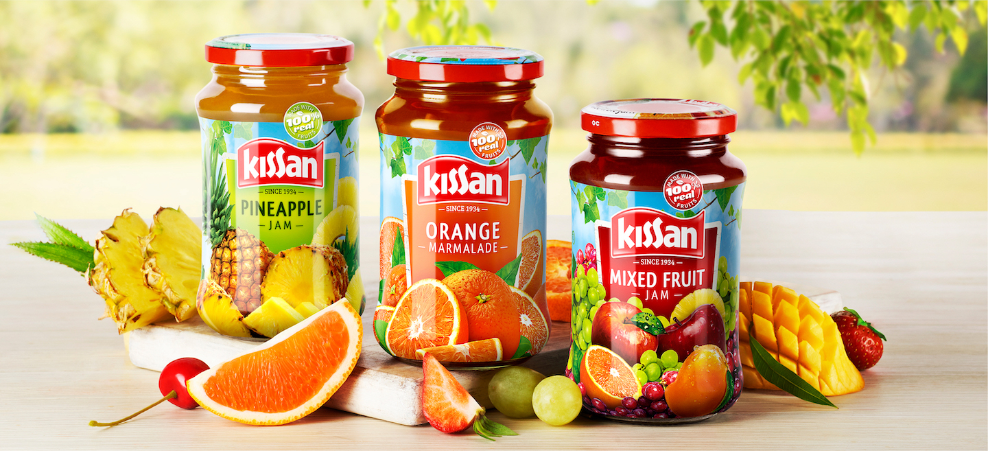
Kissan is a brand that lives in its consumers hearts. It makes its way to every kitchen, table and snack box in the country. In its 80th year, the iconic food brand set out to repackage its promise of wholesomeness.
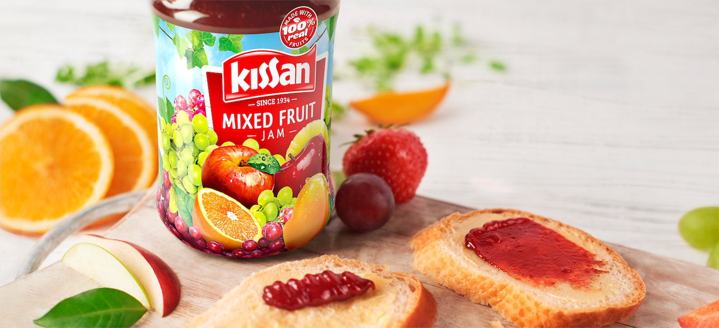
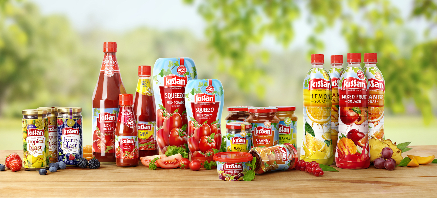
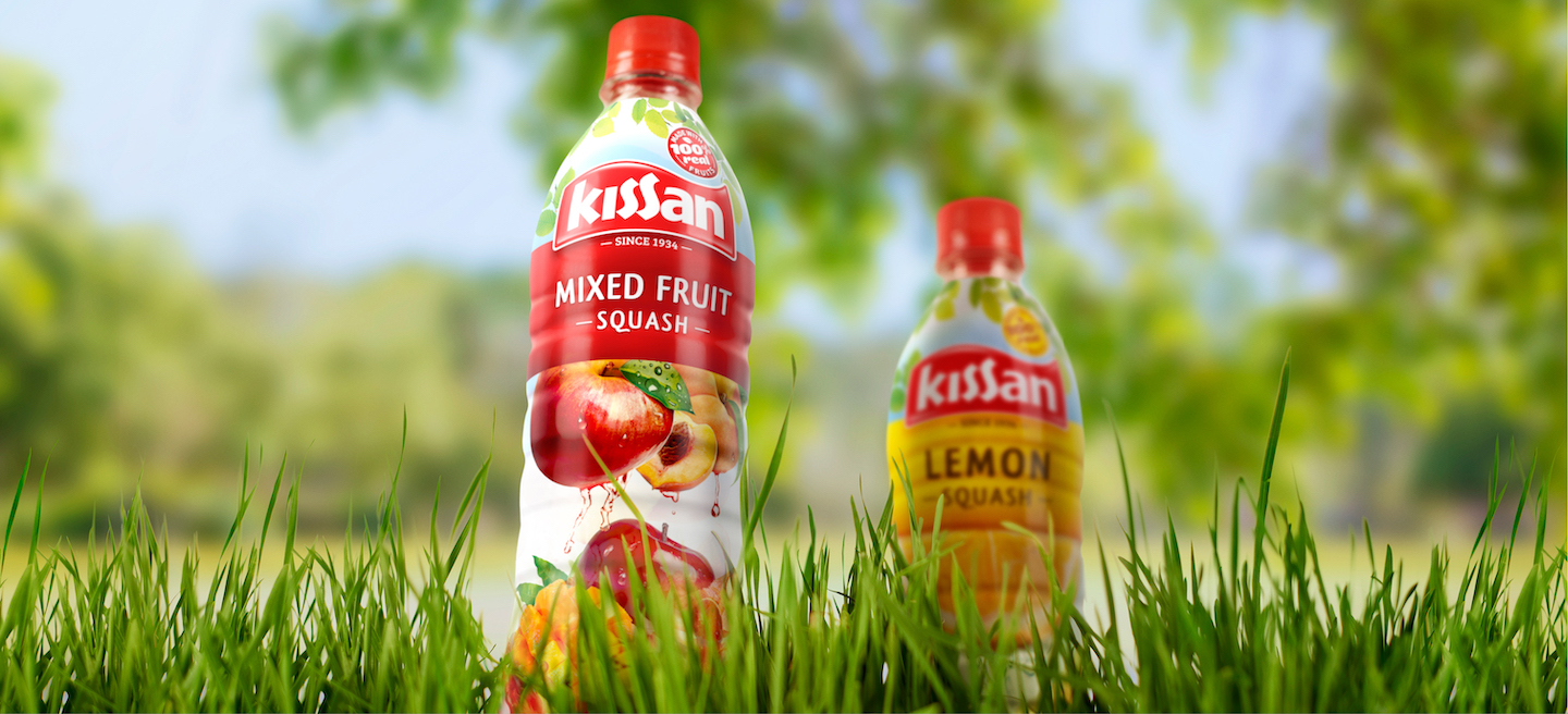
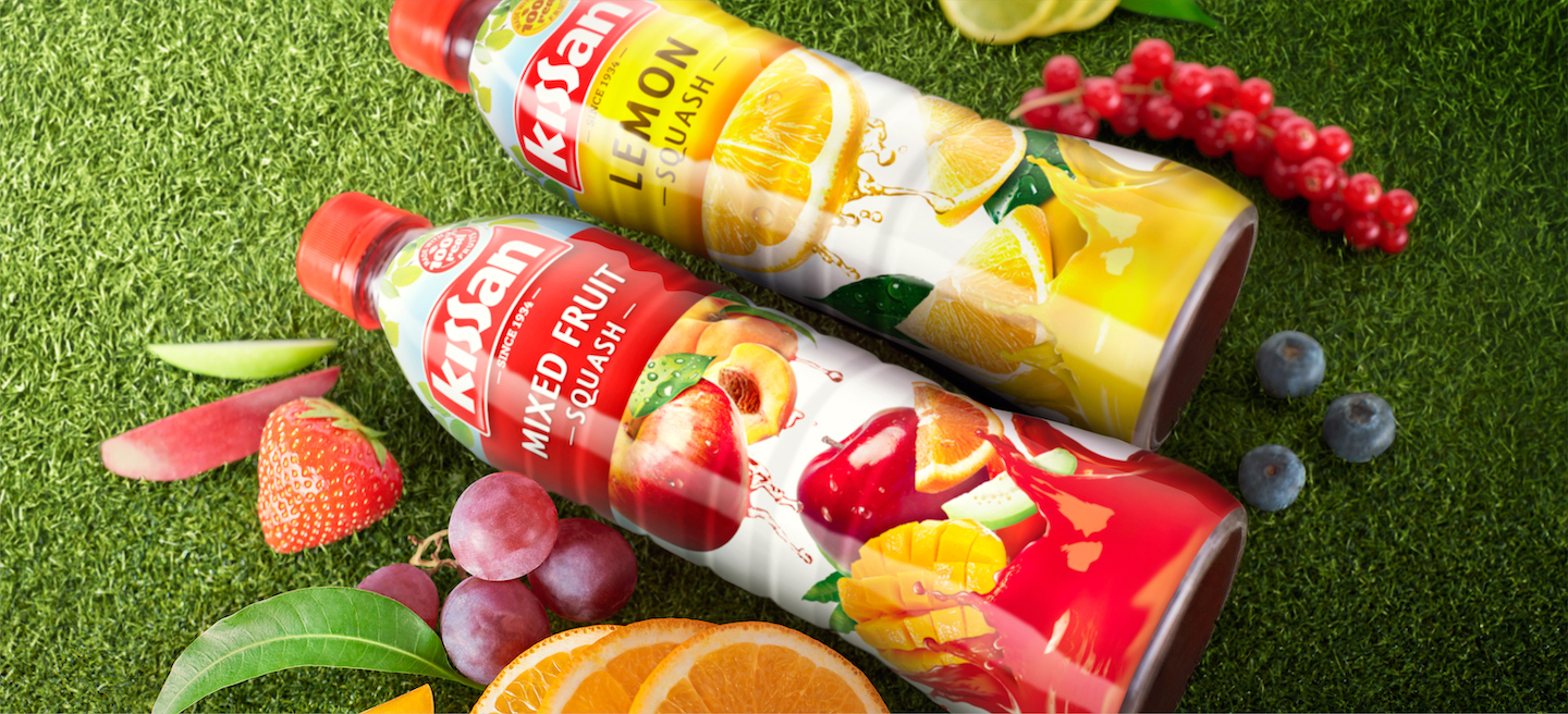
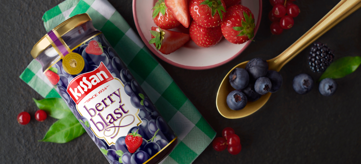
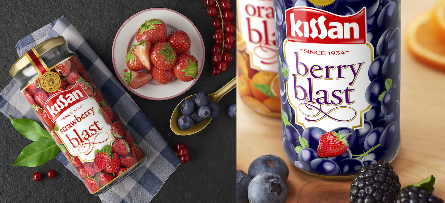
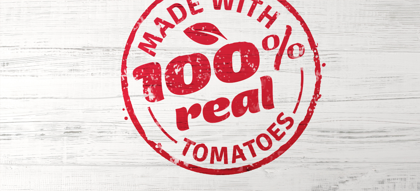
After a deep-dive into the design symbols that resonated best, we worked on simplifying the packaging by focusing on the source of nutritional goodness and appetite appeal: the ingredients. Enter larger than life farm-fresh fruit and veggies, strong varianting with color codes and a reference to the 80-year heritage, sealed-off with a stamp of 100% authenticity. Placed on a supermarket shelf, the packaging with its distinctive, red-flag Kissan logo calls out from a mile telling consumers that nostalgia now has surprises in store.